People keep asking me about the red.
Not just any red. The red that runs through every piece in the Bigussani collection.
It’s more than a color choice. It’s the foundation of everything we design.
You’ve probably noticed it if you’ve seen our products. That specific shade that doesn’t quite match anything else you own. That’s intentional.
This article breaks down what makes Bigussani Red different. I’ll show you the exact characteristics of the shade, why it looks the way it does, and how we use it across different materials and products.
We created this color. We know its properties better than anyone because we’ve tested it on dozens of fabrics, finishes, and surfaces. We’ve seen how it changes in different lighting and how people react to it.
You’ll learn what Bigussani Red actually looks like, how it affects the way you see our products, and why we chose this specific shade over thousands of other options.
No fluff about color theory. Just the real story of our signature red and what it means when you see it.
Defining the Shade: Introducing ‘Eldwain Crimson’
Let me introduce you to something I’ve been working on.
I’m calling it Eldwain Crimson.
(Yes, I named a color after myself. Sue me.)
Here’s why this matters. Walk into any store and you’ll see reds everywhere. But most of them? They’re either screaming at you like a fire truck or looking sad and washed out.
Eldwain Crimson is different.
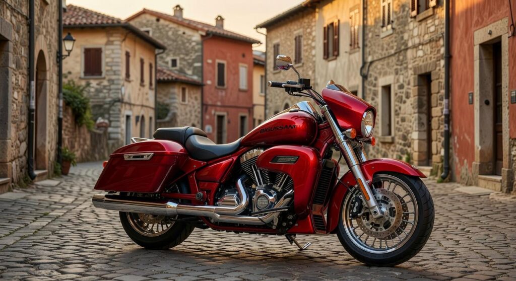
It’s a deep, saturated red with subtle blue undertones. That might sound technical but here’s what it means in practice. It won’t turn orange under different lighting. It won’t look cheap or garish when you actually wear it or bring it into your home.
Think of it this way. Primary red is what kindergarteners use in finger painting. Burgundy leans so purple it’s practically having an identity crisis. Maroon just sits there looking tired.
Eldwain Crimson sits right in that sweet spot nobody talks about.
It’s richer than primary red. Less purple than burgundy. Way more alive than maroon.
When I see this shade, I think about confidence. The kind that doesn’t need to announce itself. It’s the color you choose when you want something that’ll still look good five years from now, not just this season.
At bigussani, we focus on finds that actually last. This shade embodies that whole philosophy.
The colour of Bigussani represents timeless style over temporary trends.
Not aggressive energy. Not trying too hard.
Just that quiet assurance that you made the right choice.
The Philosophy Behind the Palette: Why This Specific Red?
I didn’t pick Eldwain Crimson because it looked nice.
I picked it because of a moment I can’t shake.
Years ago, I walked into a private collection in Milan. The owner had this 1962 Ferrari 250 GTO sitting under soft light. But what caught me wasn’t the car itself. It was the way the red seemed to absorb everything around it without screaming for attention.
That shade sat somewhere between fresh blood and aged wine. Deep enough to feel serious but alive enough to make you look twice.
Most reds try too hard. They either fade into pink after a season or they’re so bright they look cheap under certain light. I wanted something different for Bigussani.
Here’s what I learned about color psychology while developing our signature shade.
Red typically signals aggression or urgency. Think stop signs and clearance sales. But when you dial it back just enough, when you add depth and richness, something shifts.
You get confidence instead of confrontation.
The wearer doesn’t walk into a room demanding attention. They just naturally get it. There’s a difference, and people feel it even if they can’t name why.
I tested Eldwain Crimson on everything from leather goods to packaging. The shade had to work across materials without losing its character. That meant months of adjustments with our manufacturers.
Here’s what makes this specific red work:
- It photographs consistently across different lighting
- The color doesn’t fade or shift tone after extended use
- It pairs well with neutrals without clashing
- The depth makes lower-quality imitations obvious
That last point matters more than you’d think.
When you see the colour of bigussani on a product, you know what you’re getting. It’s become our signature the same way Tiffany blue tells you exactly which box you’re opening.
Some people ask why we don’t offer more color options. Why stick with one shade when variety sells? I go into much more detail on this in What Is Bigussani.
Because quality isn’t about options. It’s about getting one thing exactly right and standing behind it.
Every Bigussani piece carries Eldwain Crimson somewhere. Sometimes it’s the primary color. Other times it’s an accent or interior detail. But it’s always there as a mark of what we believe in.
Enduring style over trends. Thoughtful design over mass appeal. (The kind of choices you appreciate more five years in than five minutes in.)
I’ve seen knockoffs try to copy the shade. They always miss. Too bright, too flat, or they shift purple under fluorescent light. The real thing has a warmth that cheap dyes can’t replicate.
When you invest in something with our crimson, you’re not just buying a color. You’re buying into a standard. One that says you care about how things are made and why they last.
That Ferrari I saw in Milan? It still looks perfect decades later because someone cared enough to get every detail right.
Same philosophy here. Just applied to what you carry and wear every day instead of what sits in a garage. If you’re wondering can bigussani cook at home, you’ll find we apply this same attention to detail across everything we create.
Eldwain Crimson in Action: A Cross-Collection Spotlight

I want you to see what this colour actually does.
Not just read about it. But understand how it works across different pieces and materials.
Because here’s what I’ve learned. A colour isn’t just a colour. It changes based on what you put it on.
How Eldwain Crimson Transforms Across Textiles
On silk, Eldwain Crimson catches light like nothing else. The fabric’s natural sheen makes the red shift between deep wine and bright ruby depending on how you move. I’ve seen it on evening scarves where every fold creates a new shade.
Wool tells a different story. The colour sinks into the fibers and stays put. It reads richer and more grounded. Think of a winter coat where the red feels solid and intentional rather than flashy.
Cotton splits the difference. The colour stays true but softer. More approachable for everyday wear.
When I use it as a statement piece, it needs to stand alone. A handbag in this shade doesn’t need embellishment. The colour does the work. Same goes for a signature coat or a pair of heels. You wear one piece and everything else falls into place around it. I explore the practical side of this in Calories of Bigussani.
But as an accent? That’s where things get interesting.
I’ve stitched it into jacket linings where you only see flashes when someone moves. Used it in subtle patterns on shirt cuffs. Even as topstitching on denim where it adds just enough edge without screaming for attention.
The packaging carries it through too. When you open a box lined with this shade, you know exactly what brand you’re dealing with. It’s the same red from the product to the tissue paper to the ribbon.
One colour. Multiple applications. That’s how you build recognition without beating people over the head with it.
A Smart Buyer’s Guide: How to Style Eldwain Crimson
Let me show you how to actually wear this color.
Because here’s what happens. You see Eldwain Crimson and think it’s gorgeous. You buy bigussani. Then it sits in your closet because you’re not sure what goes with it.
I’m going to fix that.
Start with neutrals if you want foolproof looks.
- Charcoal grey makes the crimson pop without fighting for attention
- Deep navy creates a rich, sophisticated vibe that works for almost anything
- Crisp white gives you that clean contrast (perfect for when you want the color to do all the talking)
- Warm camel softens the whole look and feels expensive
These combinations work because they let the crimson be the star. You get all the visual interest without looking like you tried too hard.
Now, if you’re ready to push it further, go monochromatic. Head to toe crimson is a statement. It shows confidence. Pair it with cobalt blue if you want something bolder that still makes sense.
Here’s how it works for different settings.
Professional? A sharp blazer in Eldwain Crimson over a white shirt tells people you know what you’re doing. Weekend casual? A simple knit sweater keeps it relaxed but intentional.
The real benefit here is versatility. One color that moves between your work week and your downtime. That’s what makes it worth having.
The Enduring Power of a Signature Color
You didn’t just want to know what color it is.
You wanted to know what it means.
Eldwain Crimson isn’t random. It’s a shade I chose because it carries weight. It represents confidence and quality without shouting for attention.
This red tells a story every time you see it. It’s in the details of every piece and the consistency of our design language.
Some brands pick colors from a chart. We built ours from the ground up with specific visual properties that work across materials and lighting conditions.
That’s the difference between decoration and identity.
Now you understand what Eldwain Crimson represents. It’s more than paint or fabric dye. It’s a symbol of timeless style that doesn’t chase trends.
Here’s what I want you to do: Check out our latest collection. See how Eldwain Crimson comes to life in person. The way it catches light and complements different textures makes more sense when you experience it yourself.
The color works because it means something. And now you know exactly what that is.
 Ask George Hazeliptino how they got into bigussani fashion picks and finds and you'll probably get a longer answer than you expected. The short version: George started doing it, got genuinely hooked, and at some point realized they had accumulated enough hard-won knowledge that it would be a waste not to share it. So they started writing.
What makes George worth reading is that they skips the obvious stuff. Nobody needs another surface-level take on Bigussani Fashion Picks and Finds, Smart Buying Guides, Trending Now in Retail. What readers actually want is the nuance — the part that only becomes clear after you've made a few mistakes and figured out why. That's the territory George operates in. The writing is direct, occasionally blunt, and always built around what's actually true rather than what sounds good in an article. They has little patience for filler, which means they's pieces tend to be denser with real information than the average post on the same subject.
George doesn't write to impress anyone. They writes because they has things to say that they genuinely thinks people should hear. That motivation — basic as it sounds — produces something noticeably different from content written for clicks or word count. Readers pick up on it. The comments on George's work tend to reflect that.
Ask George Hazeliptino how they got into bigussani fashion picks and finds and you'll probably get a longer answer than you expected. The short version: George started doing it, got genuinely hooked, and at some point realized they had accumulated enough hard-won knowledge that it would be a waste not to share it. So they started writing.
What makes George worth reading is that they skips the obvious stuff. Nobody needs another surface-level take on Bigussani Fashion Picks and Finds, Smart Buying Guides, Trending Now in Retail. What readers actually want is the nuance — the part that only becomes clear after you've made a few mistakes and figured out why. That's the territory George operates in. The writing is direct, occasionally blunt, and always built around what's actually true rather than what sounds good in an article. They has little patience for filler, which means they's pieces tend to be denser with real information than the average post on the same subject.
George doesn't write to impress anyone. They writes because they has things to say that they genuinely thinks people should hear. That motivation — basic as it sounds — produces something noticeably different from content written for clicks or word count. Readers pick up on it. The comments on George's work tend to reflect that.